

THE Problem:
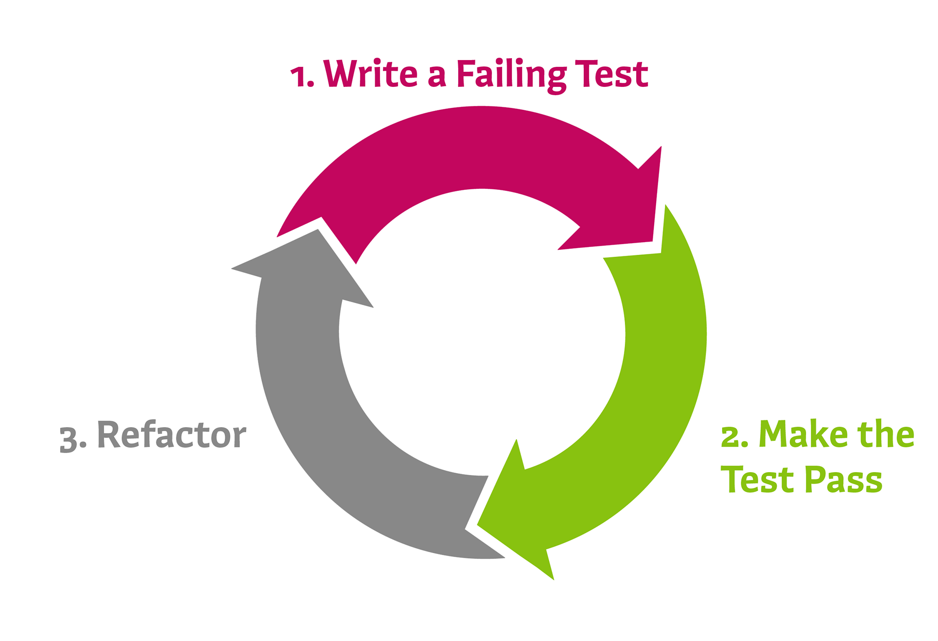
At AIR Worldwide, a lot of the developers practice test-driven development (TDD). TDD is a software development practice where requirements are turned into unit tests first and then code is written to make those tests pass. As a result, developers end up generating a lot of tests as they develop features to meet those requirements. After this, developers also have to go through the time-consuming process of manually filling out a form to associate the test cases to user stories on Microsoft TFS Test, the project management tool AIR used.
Tool Description:
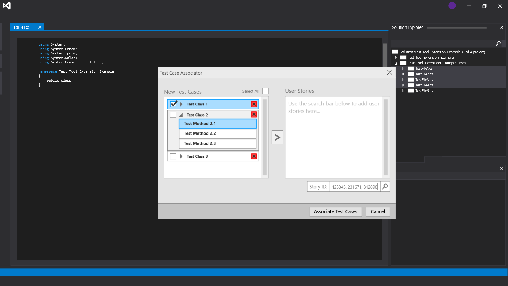
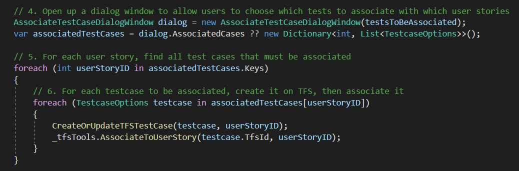
To help streamline the association of test methods in our DLLs to user stories in TFS Test, I was tasked with creating a Visual Studio extension. This tool allows users to right-click classes containing test methods in the Solution Explorer in Visual Studio, the IDE virtually all of the developers used, to do just that. Having tests associated in TFS Test enabled the team make use of a number of its test management features: viewing test history, analytics, categorization, etc. Simply put, a VSIX extension that integrates directly into their IDE is convenient for developers.
PROCESS:
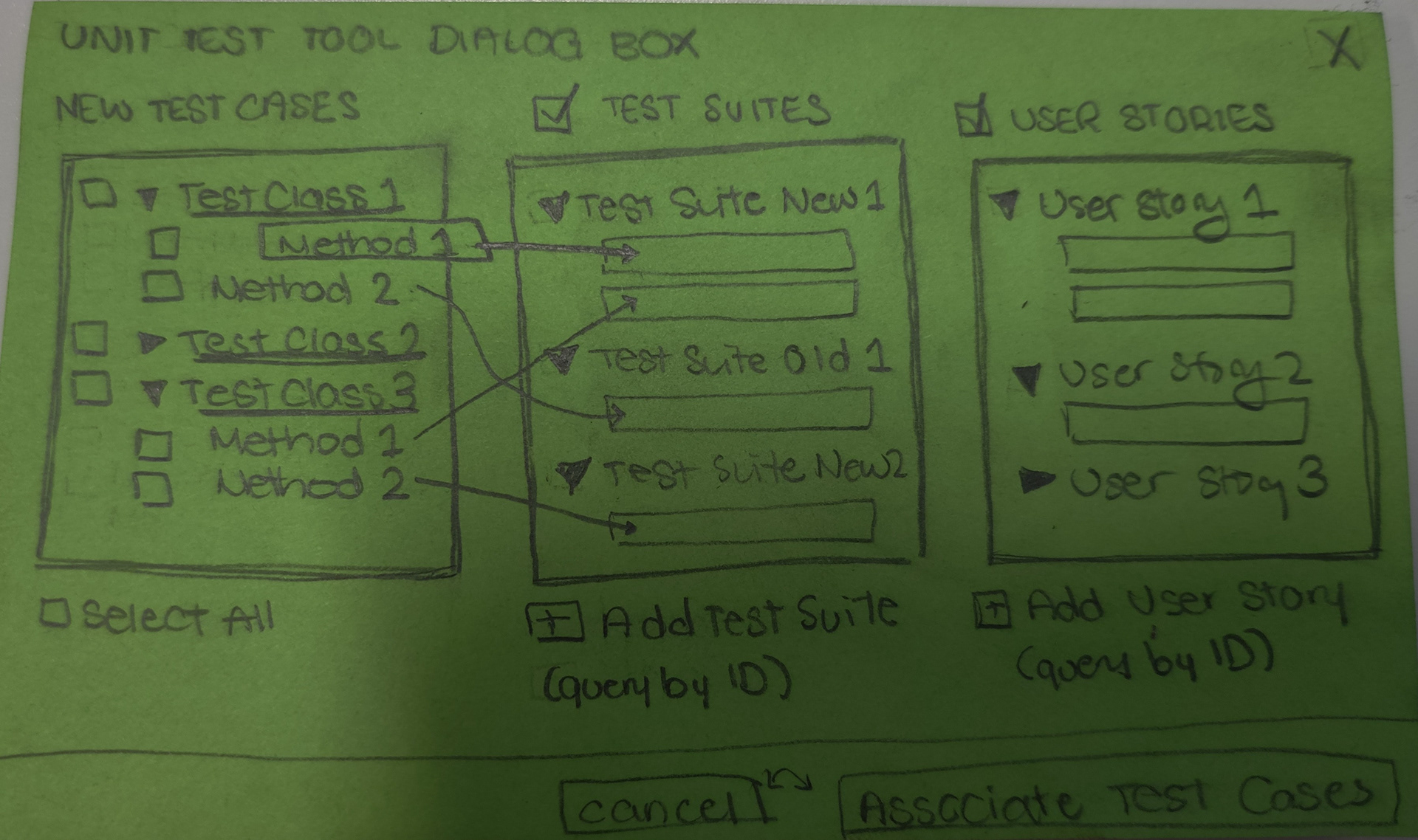
When I started this project, I began with an ideal design of the interface first. Initially, I didn't concern myself with what I could program. Along the way to implementing this tool, I also met with the heads of the department for design meetings, had near weekly demos with my supervisor and kept extensive notes and sketches of design ideas to consider no matter how bad they were.

Research:
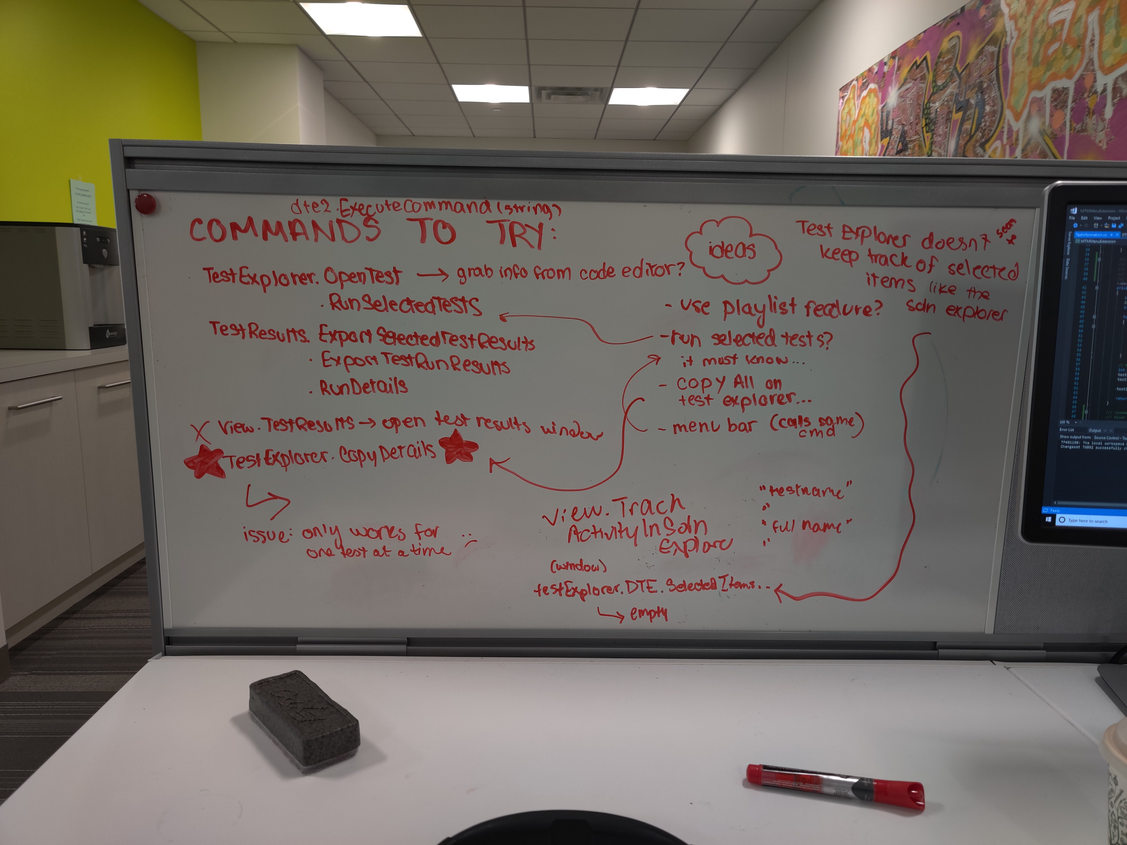
The biggest challenges for creating the tool had to do with learning the capabilities of VSIX independently and with little documentation as well as finishing a MVP before the end of my internship. Originally, the plan for the test tool was to allow users to right click on test cases in Visual Studio's Test Explorer, but research and testing showed that this simply wasn't feasible.
Design Decisions:
Despite not having formal training in UX, I intuitively made quite a few decisions for sake of usability.
Feedback:
- The user story list opens as soon as tests are added to ensure immediate confirmation that the search succeeded.
- Clearing the search bar after a successful search. If an ID is invalid it stays in the search bar even when the other stories are found and their IDs are removed from the bar. The box also turns pink upon failure.
- Clearing the search bar after a successful search. If an ID is invalid it stays in the search bar even when the other stories are found and their IDs are removed from the bar. The box also turns pink upon failure.
Error Prevention:
- Single-select on user story list and multiselect on test case list. It wouldn't make sense for a developer to assign the same tests to multiple user stories.
- In comparison to older designs, I moved the position of the search bar up and added the lighter gray background color to prevent slips (clicking associate/cancel instead of searching).
- In comparison to older designs, I moved the position of the search bar up and added the lighter gray background color to prevent slips (clicking associate/cancel instead of searching).
Efficiency:
- Choosing to allow users to input multiple IDs if they're separated by commas for the search bar.
- Allowing users to use their keyboard for deleting.
- Allowing users to use their keyboard for deleting.
Constraints:
- Skipped "could have" features that I frankly could not implement.
- I.e.) drag and drop became an arrow.
- Unconcerned about visual design given the time crunch.
- I.e.) drag and drop became an arrow.
- Unconcerned about visual design given the time crunch.
ResultS:
After my internship ended, the extension was integrated into the departments' workflows. Furthermore, the Spring set of interns continued to worked on it, further improving upon its functionality and/or design.
Nevertheless, working on this project for my team at AIR was everything I could've hoped for before I even knew what I really wanted out of a job: R&D, figuring stuff out on my own and bugging people to see my work-in-progress projects etc.
After completing my six month internship, I drastically changed my course of study one odd night. I dropped my minors in game art and animation and tried to switch to a minor in interaction design but with no luck. I have however taken classes like Human-Computer Interaction, Game Interface Design, a second class on Web Development and a class on the foundations of software engineering (software development life cycle models, requirements analysis, user-centered design etc.). I also started my senior year with a design mentorship. In a way, this project along with the UI of Dissonant were key moments in my UI/UX origin story.
Possible Improvements:
One improvement that immediately comes to mind is reformatting the search bar. Something like Google Drive's sharing search bar would prevent errors before the user hits search and it would segment the user story IDs more clearly. Each search should also limit the input to six digits to further prevent errors. A stretch goal for this would be to display the user story name instead of the number as new ones are added. Additionally, adding drag and drop functionality would've been nice.