
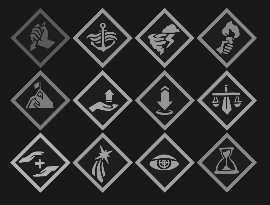
iconography:
One of my tasks on the team was to redesign the game's original icons displayed below.


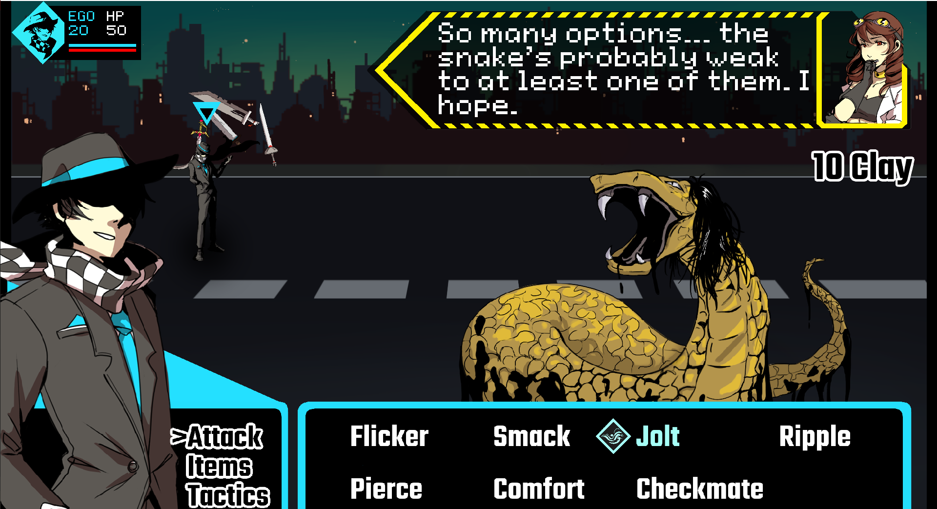
The icons represent the following traits and affected battle move types/effects:
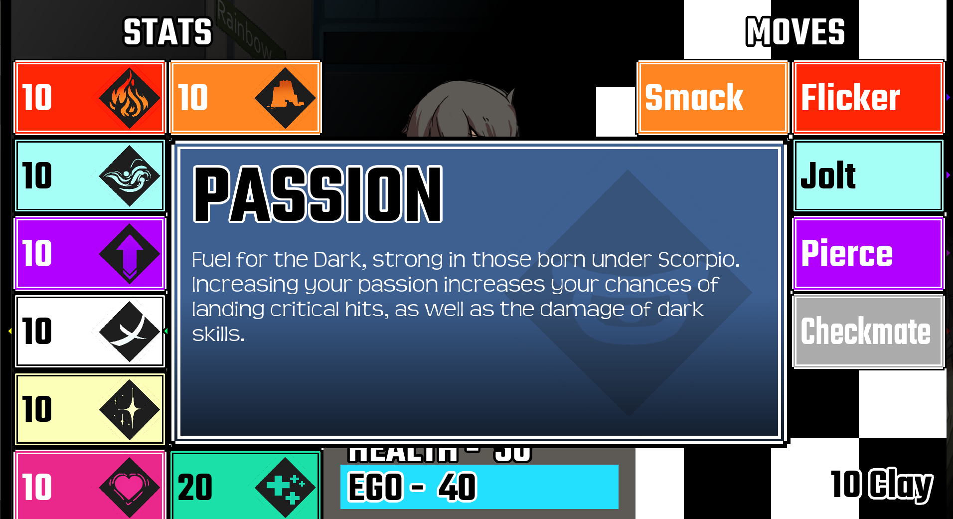
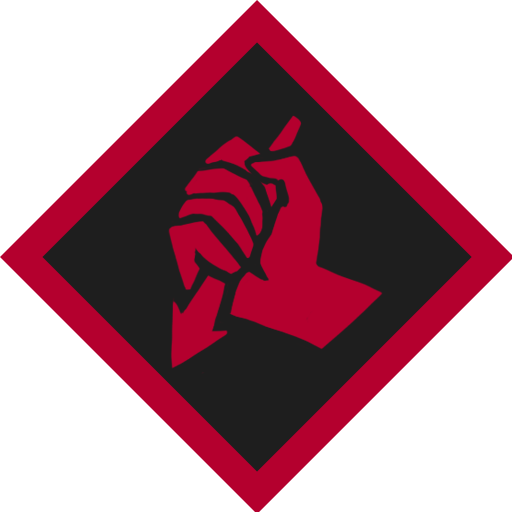
Passion & Critical Hits and Dark-Type Attacks
Reliability & Water Attacks
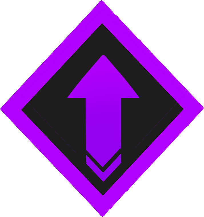
Versatility & Wind and Lightning Attacks
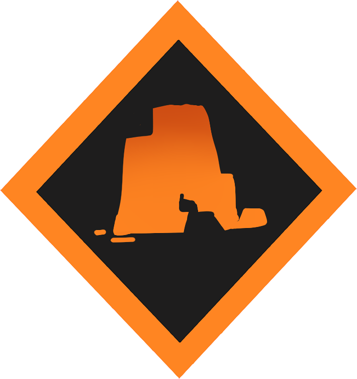
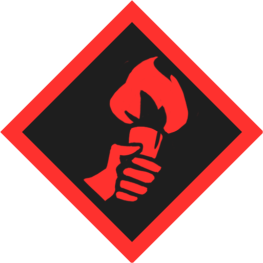
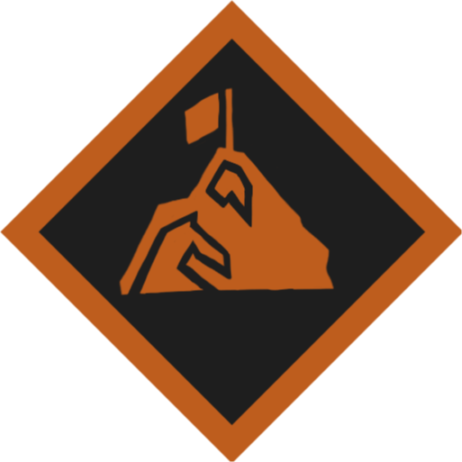
Adventure & Fire Attacks
Determination & Earth Attacks and Min Hit Damage
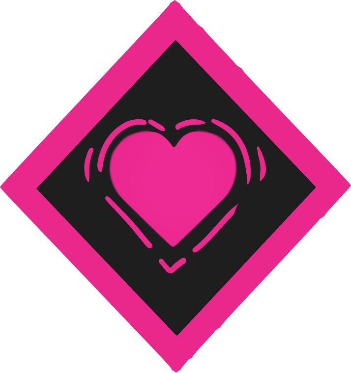
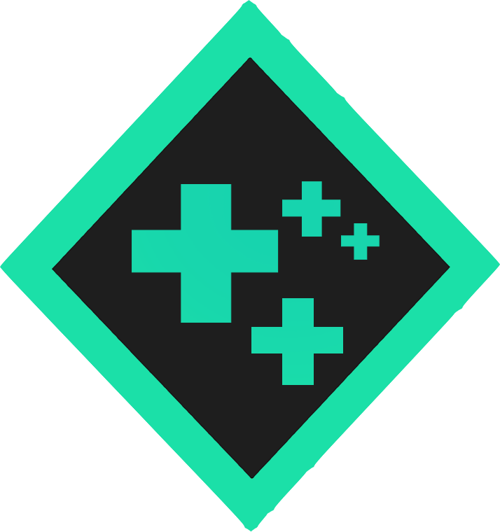
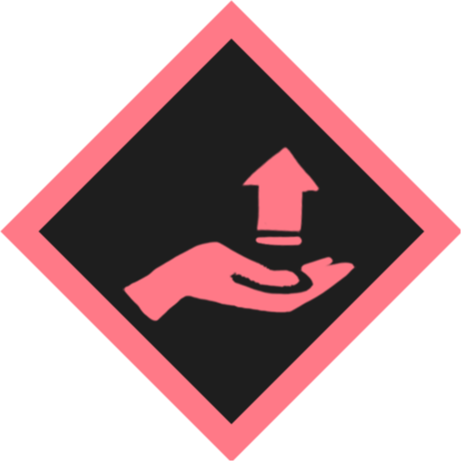
Kindness & Party Buffs
Leadership & Dungeon Navigation
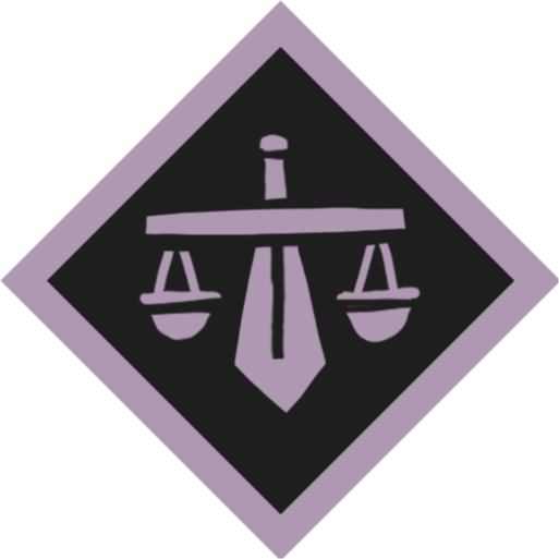
Justness & Strength of Sever Attacks
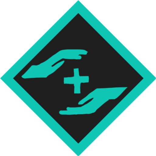
Empathy & Health and Healing Skills
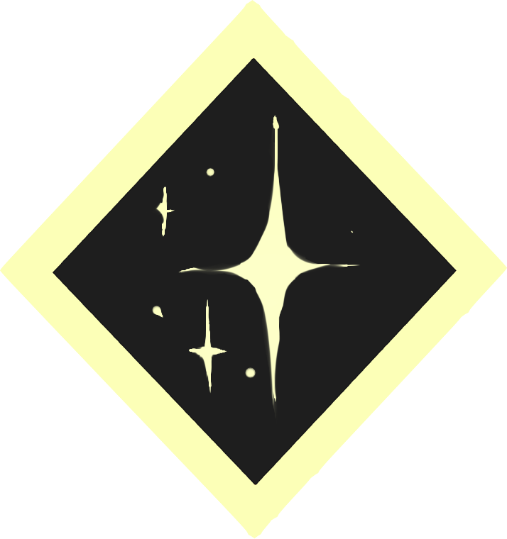
Hope & XP Gained and Light Attacks
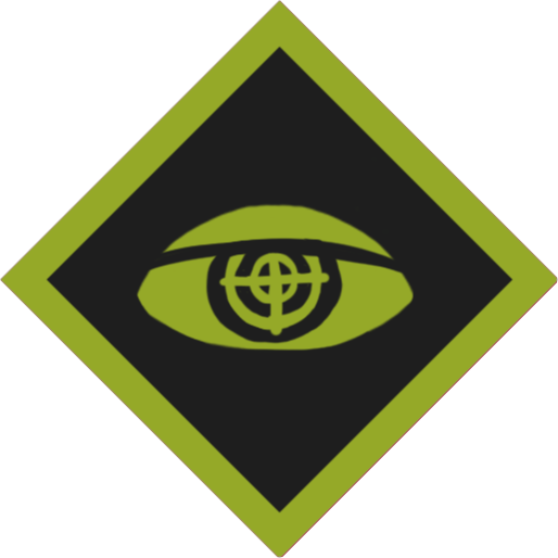
Perception & Looting Luck and Snipe Skills
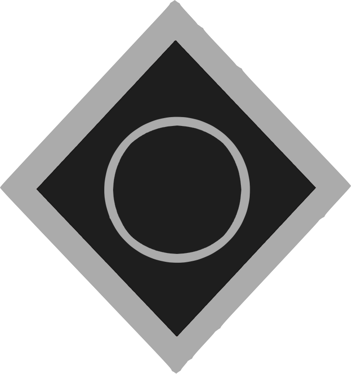
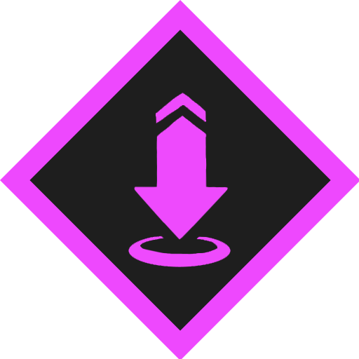
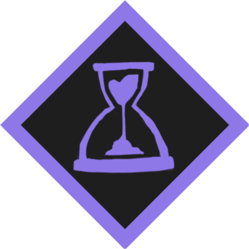
Patience & Stat Increase over Time and Null Attacks
The descriptions for these traits can be found on the game's subreddit r/antiem, but here's an excerpt:
Adventure is the stat of wayfarers and explorers. Associated with fire, and the star sign Aries, it directly increases the maximum damage you can deal with attacks of any element.
An adventurous person will always push themselves beyond their limits, of course! An adventurous person draws their strength from new experiences, and never feels quite as powerful as when they have no idea what's going on.
However, a person who's constantly jetting off towards new experiences may have some problems cultivating that which they've already gathered, signifying a lack of reliability. In-game, it can be improved by being willing to put yourself into the unknown, even at personal risk.
Challenges:
As these icons all represent at least two details about party members and moves, I relied heavily on visual metaphors to communicate this information. The challenge here was to avoid making the icons too complicated.
Below are some of the connections I made for the glyphs:
Water & Reliability: Submerged anchors keep ships from drifting away.
Passion & Critical Attacks: "The close contact required with stabbings could mean more rage, experts say."
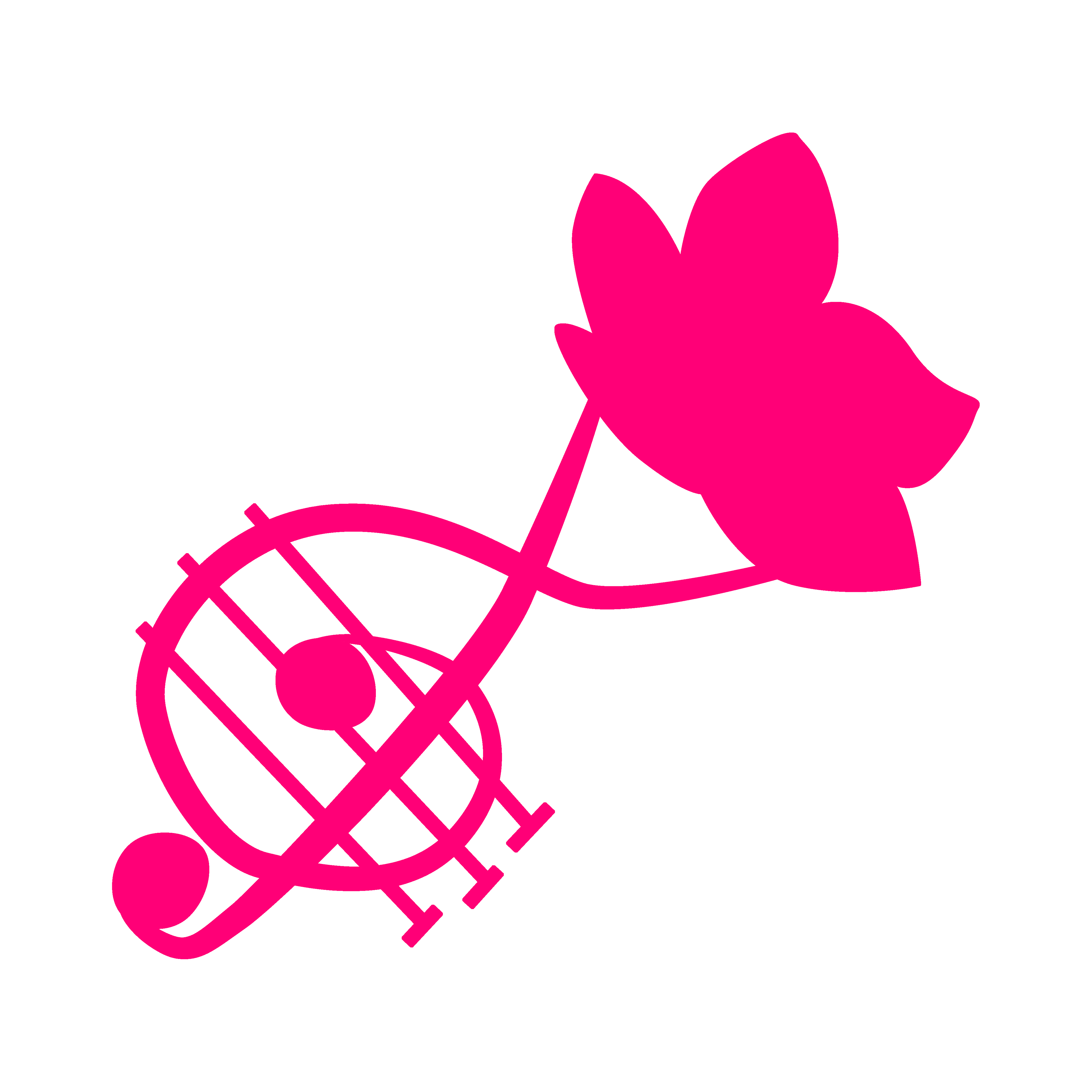
Fire & Adventure: A torch perfect for spelunking.
Empathy vs Kindness: Two hands vs one. You can try to be kind without considering the needs or wants of the receiver. But, that's kindness without empathy.
My next design decision regarding if all or none of the icons should have a gradient. Five out of the twelve icons I received were multicolored--the icon for fire and adventure stood out the most in this regard. My final decision was to opt for monocolored icons.
With that decided, my next step was to assure that all of the icons have (relatively) the same value. I wanted them to look like a cohesive set. This was especially difficult when it came to dealing with the near-white, red and various blue/green icons.
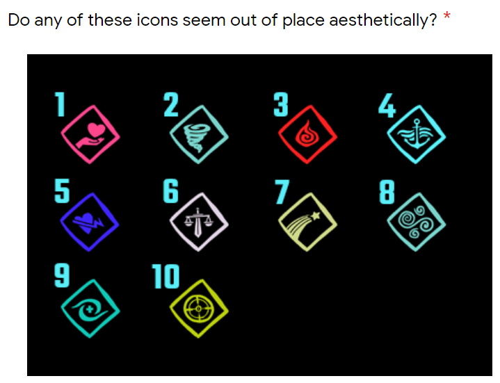
Testing & User Feedback:
As I was designing them, in order to test the consistency and clarity of each icon, I created a questionnaire with questions like the following:
1. Do any of the colors of the icons seem too similar? If so, which ones?
2. Do any of these icons seem out of place aesthetically?
3. Rate each icon based on clarity, color choice and/or general preference, with 1 being the least and 7 being the best.
4. Assign each of these personality traits to 0-2 icons: Adventure; Determination; Versatility; Reliability; Leadership; Perception; Justness; Passion; Hope; Patience; Kindness; Empathy
Some of the feedback that I received that was particularly helpful was that people thought icon #1 for Kindness and Buffs was for Healing due to the heart. This was a fair assumption. While a heart is associated with love and affection generally, in the context of a videogame, hearts do sometimes signify health. Because of this, I replaced the heart with an arrow. The arrow was also a nod to Antiem's presence on Reddit and te upvote/Karma system.
Final colored Icons:


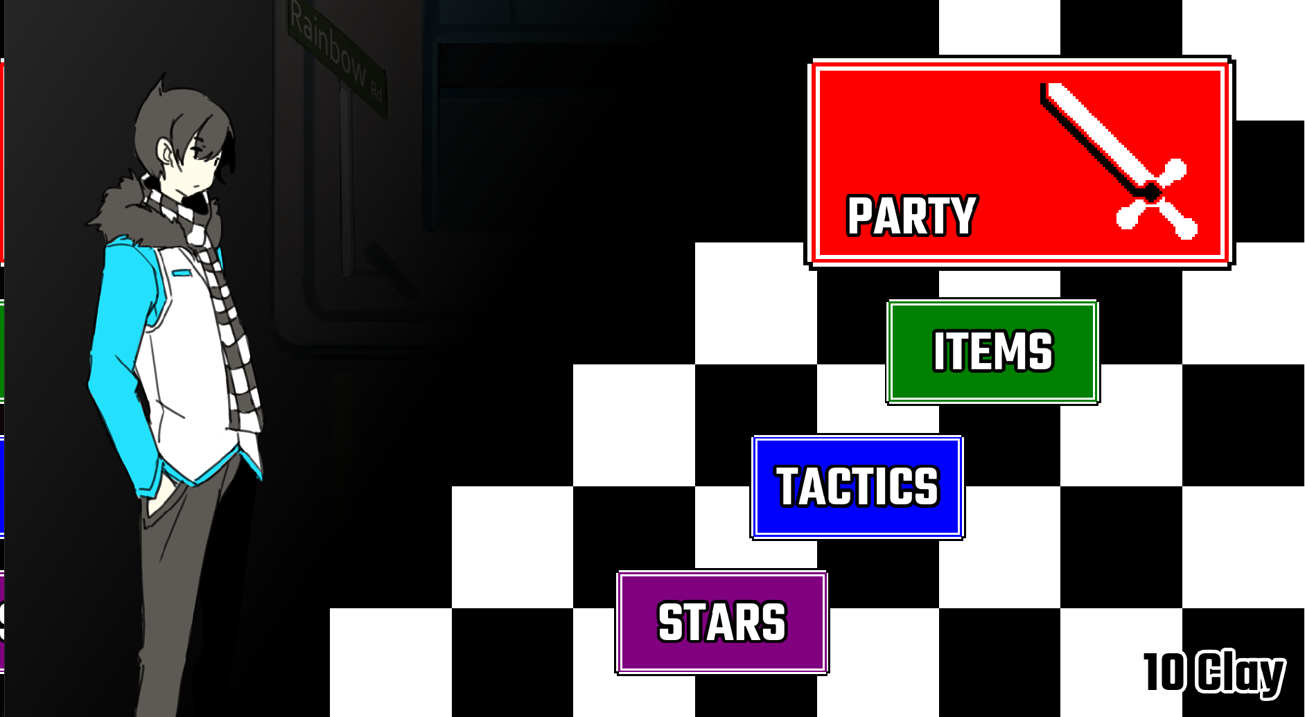
screen redesigns:
This is a collection of some of the screens I redesigned for the game. The redesigns are on the left and the original screens are on the right.