
Design Goals:
This game is a long-term, Unreal Engine project. Currently, I'm working with a concept artist, 3D modeler, composer and writer to finish up the game's prototype! I continue to work on the UI and continue programming. The core goal of the game still is that I didn't want to just create a rhythm game. To accomplish this I take note of the UI design of games like Brutal Legend and The Legend of Zelda. Nonetheless, the top two goals of the game's UI design are as follows:
1. Make it clear that this game is an action game first and foremost that needs an especially responsive player experience.
2. Clearly display to players that it is about the fluidity of music taste after the advent of music streaming.
Current Progress:
New Video!
INITIAL attempts:
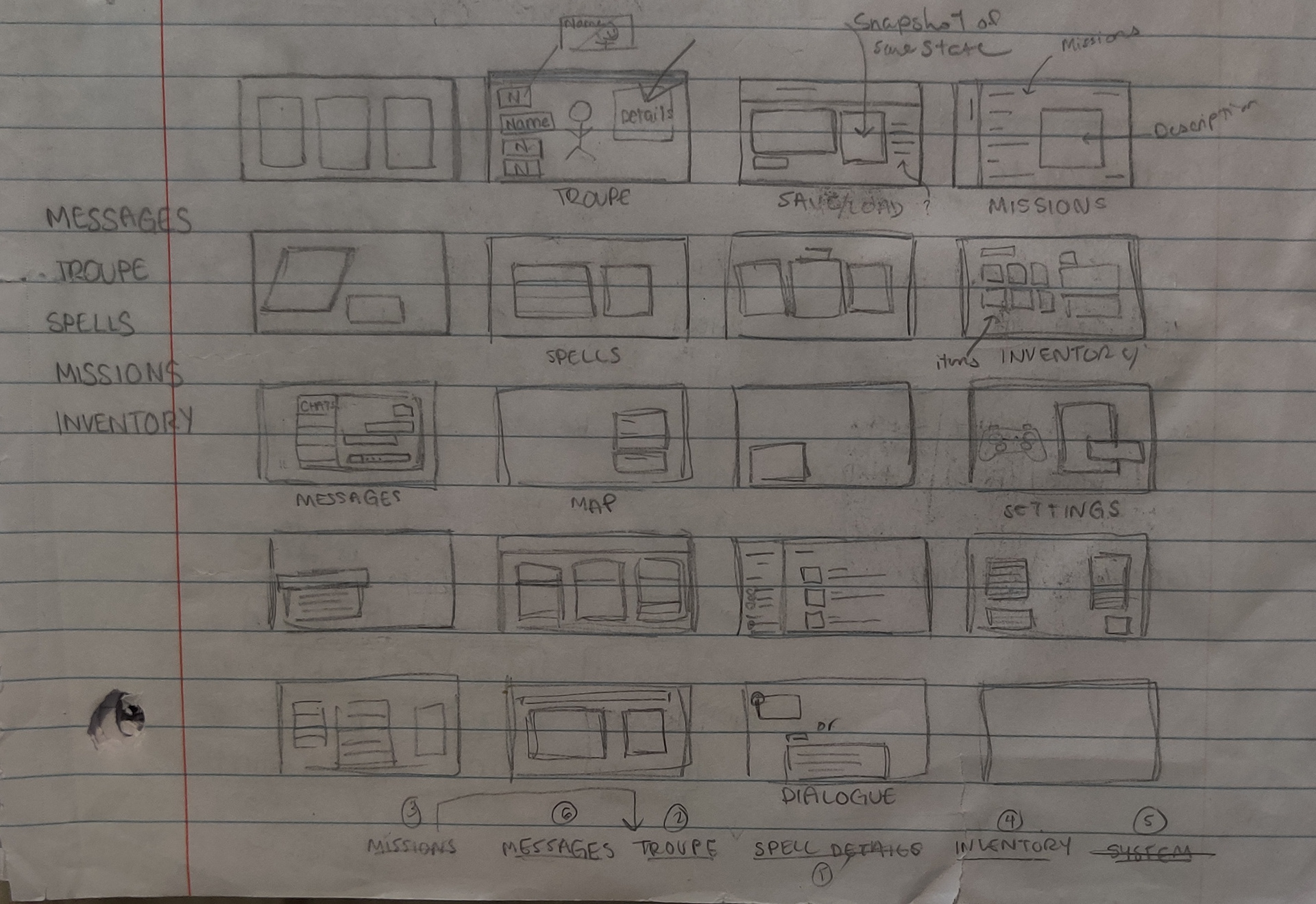
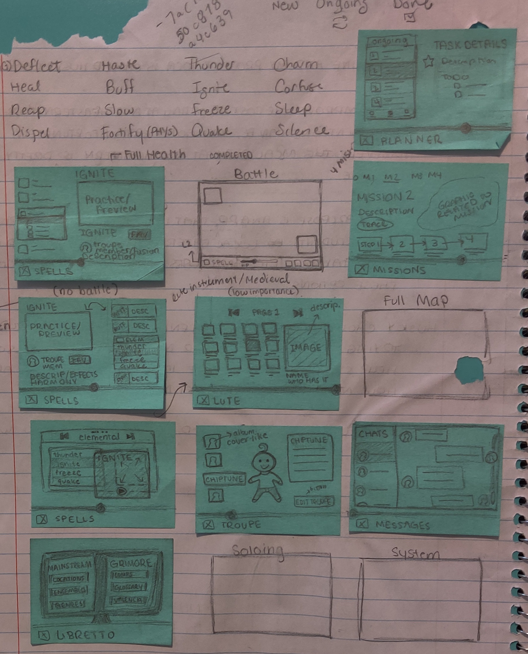
Before arriving at this design, I went through a couple iterations. Furthermore, before I learned how to use Adobe XD or even really any UX principles, I used Google Slides to sketch up and quickly playtest the UI.
The Third Iteration in Adobe XD - Link to the final UI design of the phone.
Thought Process & Mistakes:
The original UI was inspired by Watch Dogs 2's phone aesthetic and the old Animal Crossing inventory (purely out of nostalgia). I was very focused on music streaming apps and thus made the menu system a literal phone. I got caught up in designing it first. The HUD was an afterthought.
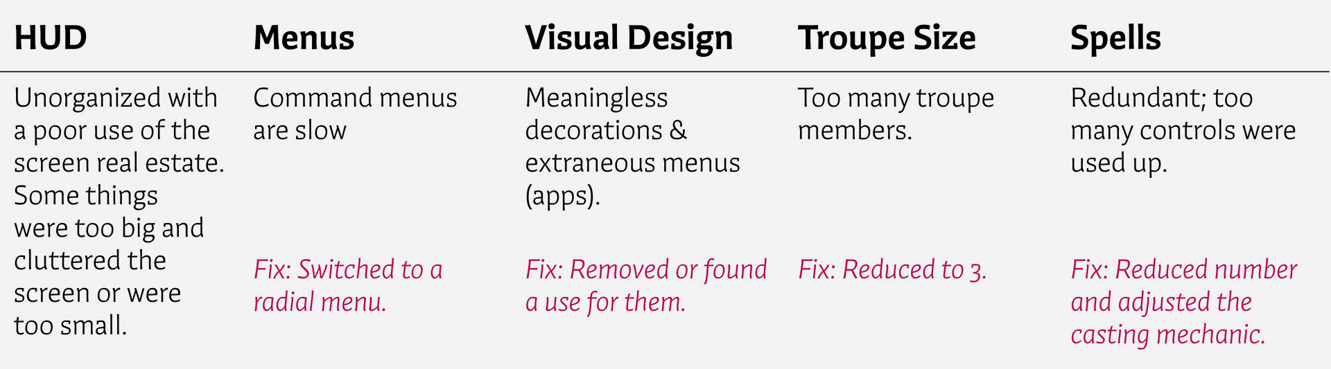
Back to the drawing board:
After trashing the phone menu, I started designing the menus from scratch. I studied various wireframes, sketched their basic shapes and then mapped some to the screens I needed. After that, I created mood boards for colors, visual motifs and fonts.

VIsual Design:
A game that helped me craft the art direction of Dissonant was Brutal Legend. As a whole, Brutal Legend only pays homage to heavy metal and the charm of going to music stores (vinyls). Dissonant's pluralistic view of music and focus on cultural competency needed something different. It was clear to me from the start that trying to capture all or a few genres in the main design would be chaotic or disingenuous.
So, I looked to music streaming services.
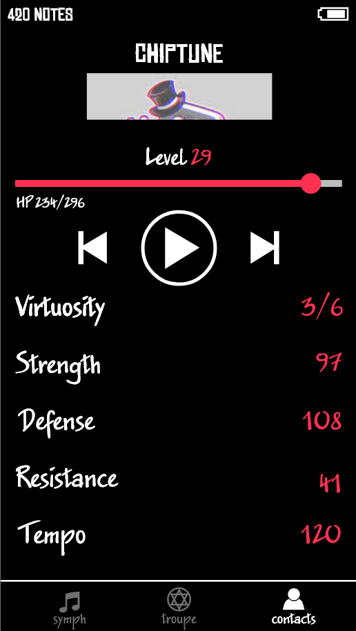
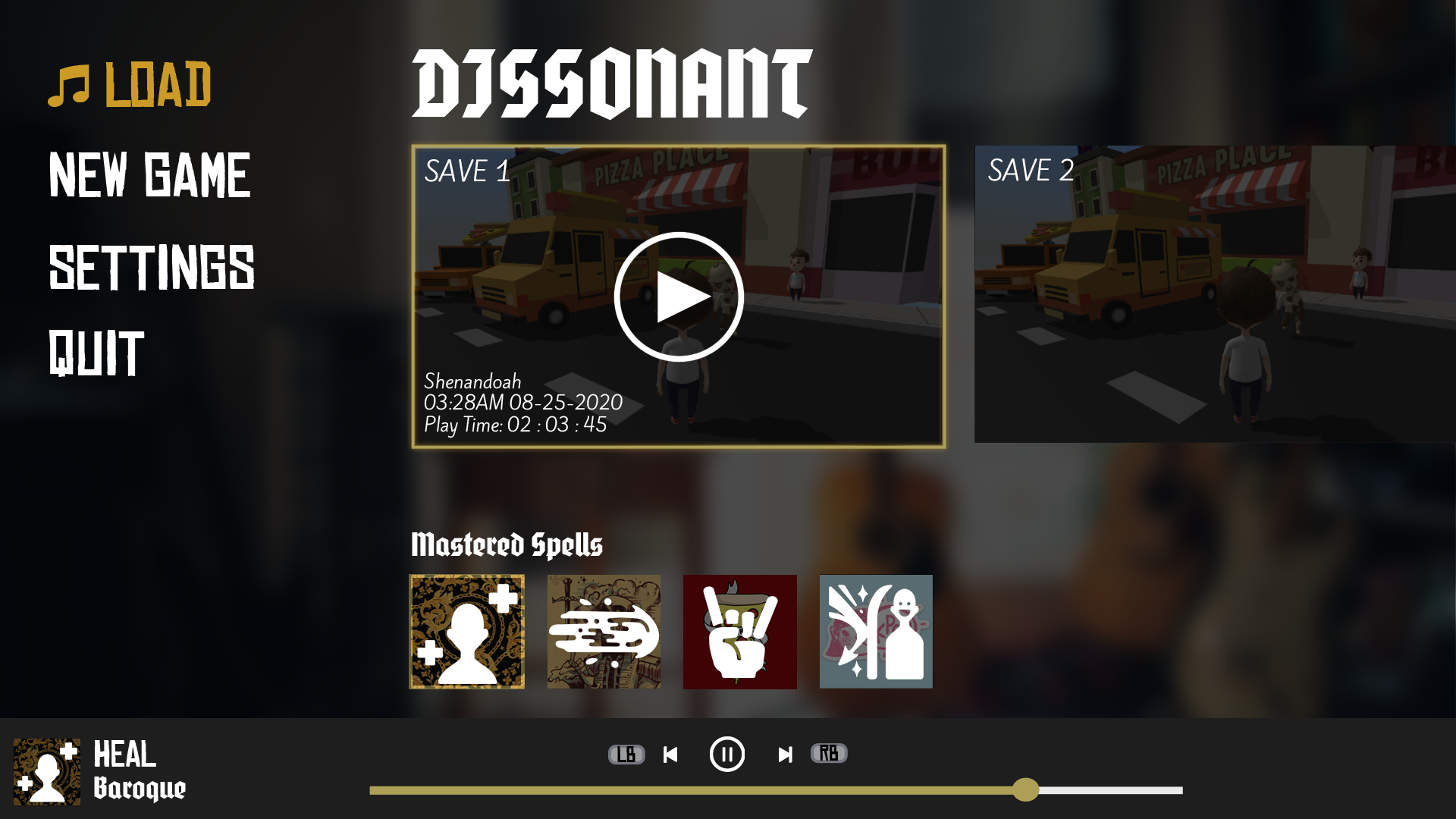
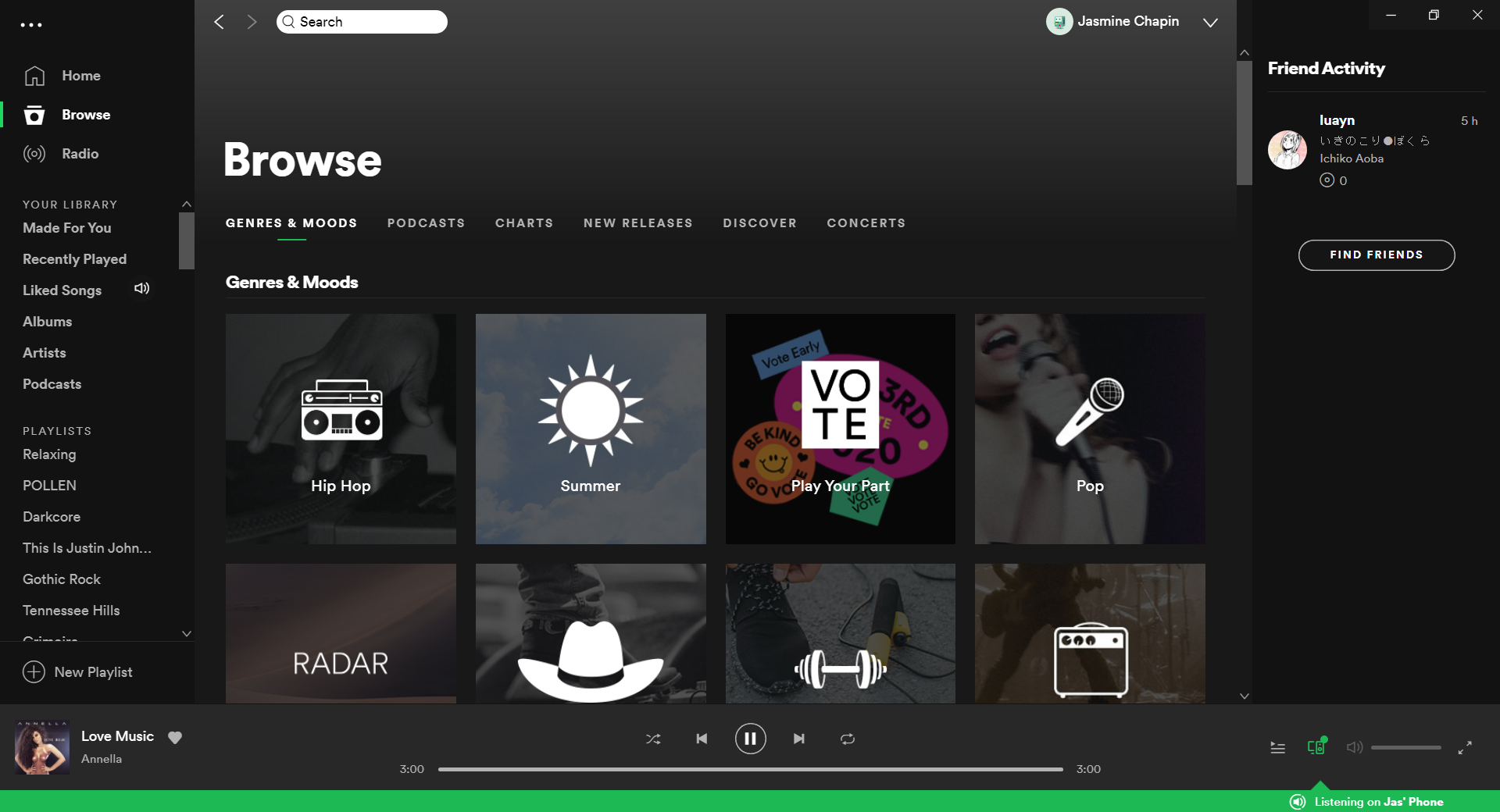
Main Menu & Spotify Desktop:
First impressions matter! Players should instantly know that this game is a gamified mixtape.
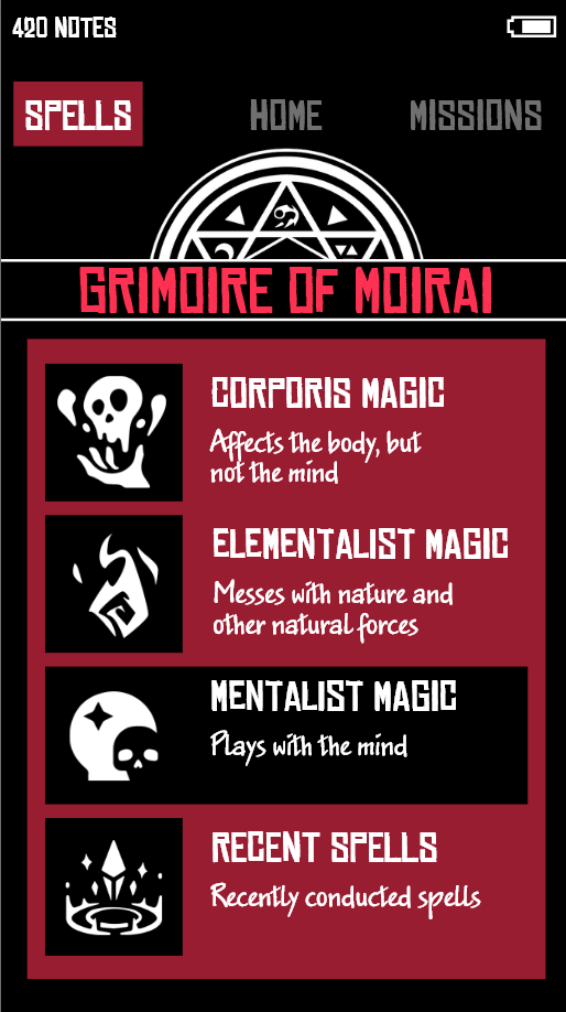
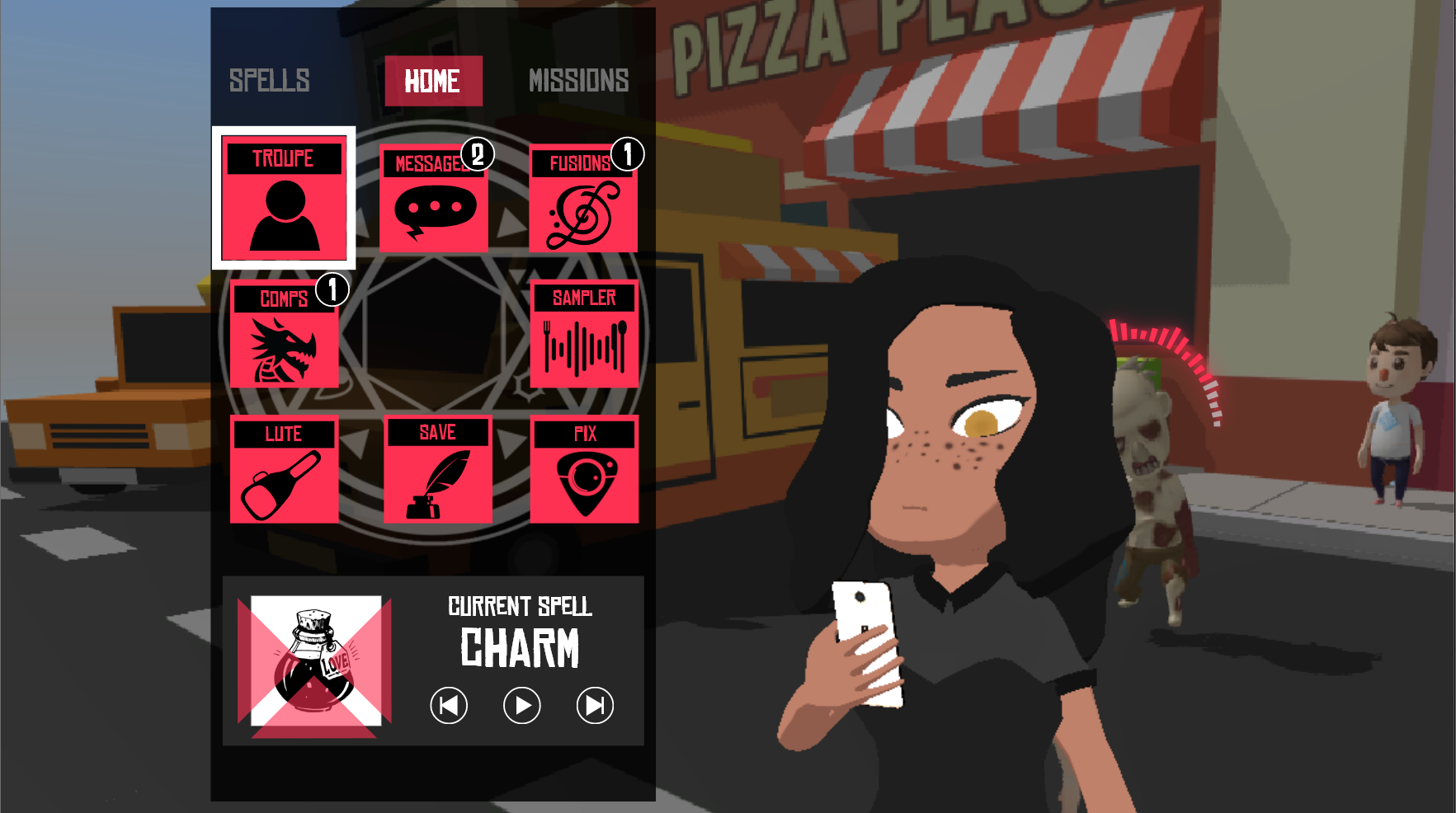
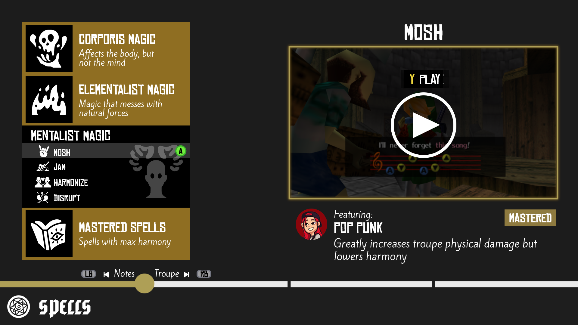
Spells (Tutorials) & YouTube:
Each spell is cast by pressing a series of buttons. Like The Ocarina of Time, players can reference the melodies of spells in the menu and see the effects they cause.
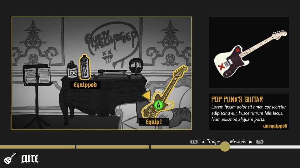
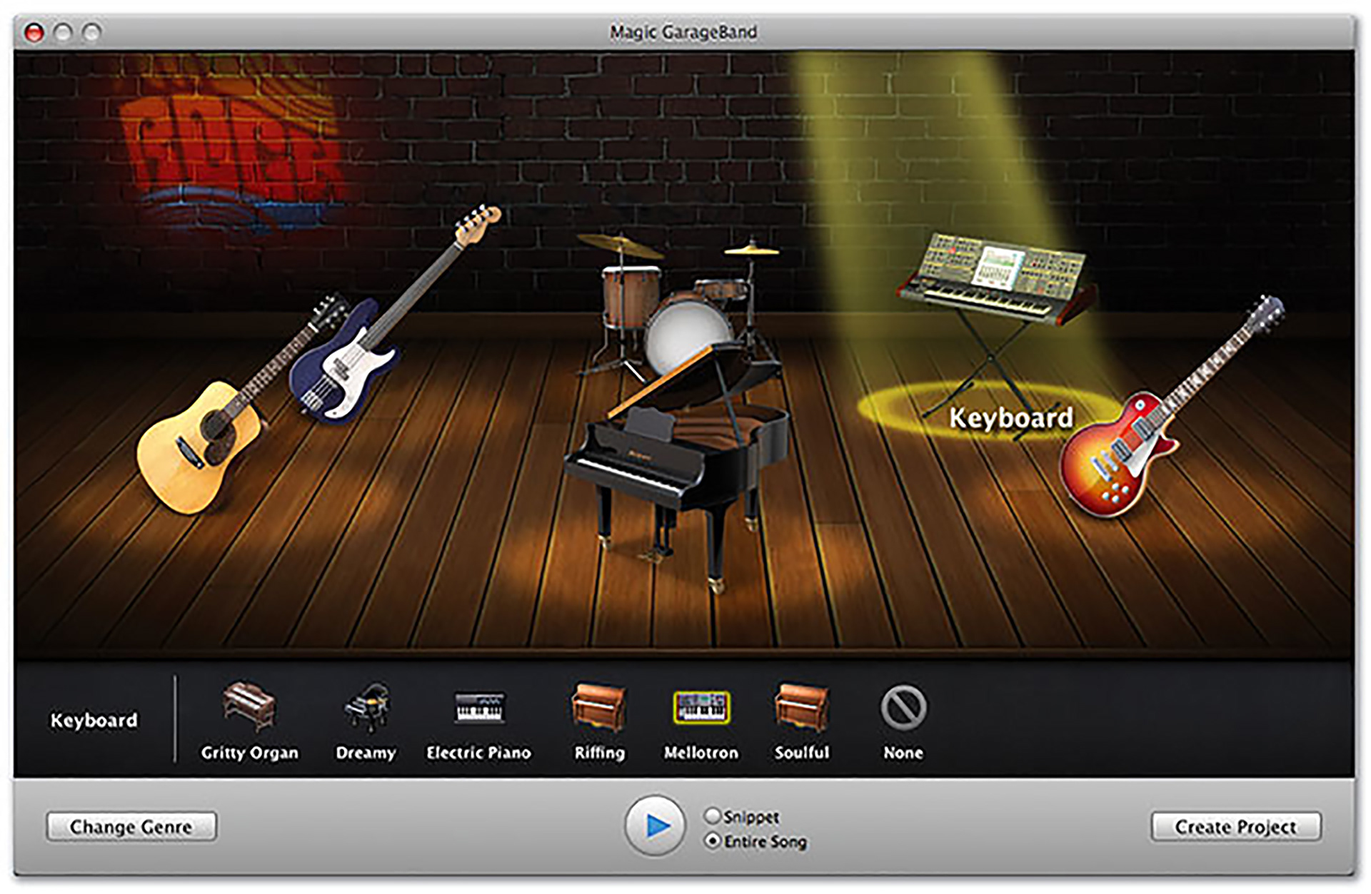
Lute (Inventory) & GarageBand:
To limit the scope of the game, I decided that the inventory would only be full of a few, distinct items related to music or subcultures. Because each item would have a recognizable silhouette, I thought showing them as objects in a room would be clear enough and efficient.
Iconography:
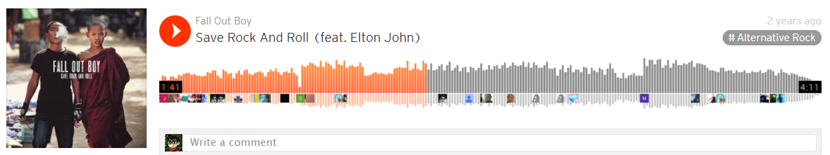
Health Bars:
I wanted the health bars to be a little more interesting than just basic progress bars. So, I drew inspiration from SoundCloud's scrubber. To draw players attention to the bars when health is low, I decided to add an animation to them that gets progressively faster and jerkier.

Static Enemy Health Bar

Troupe Member Health Bar Motion at 80%
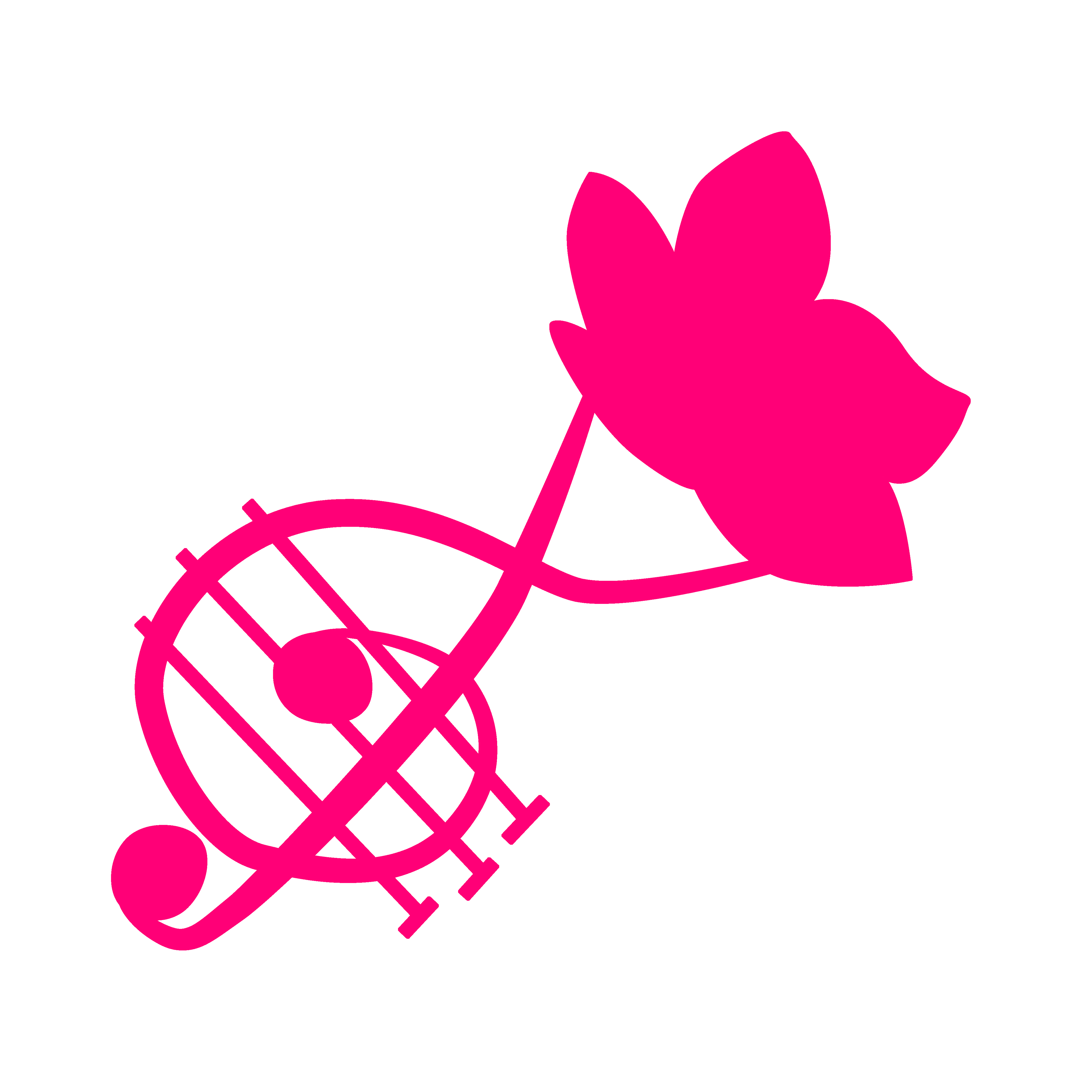
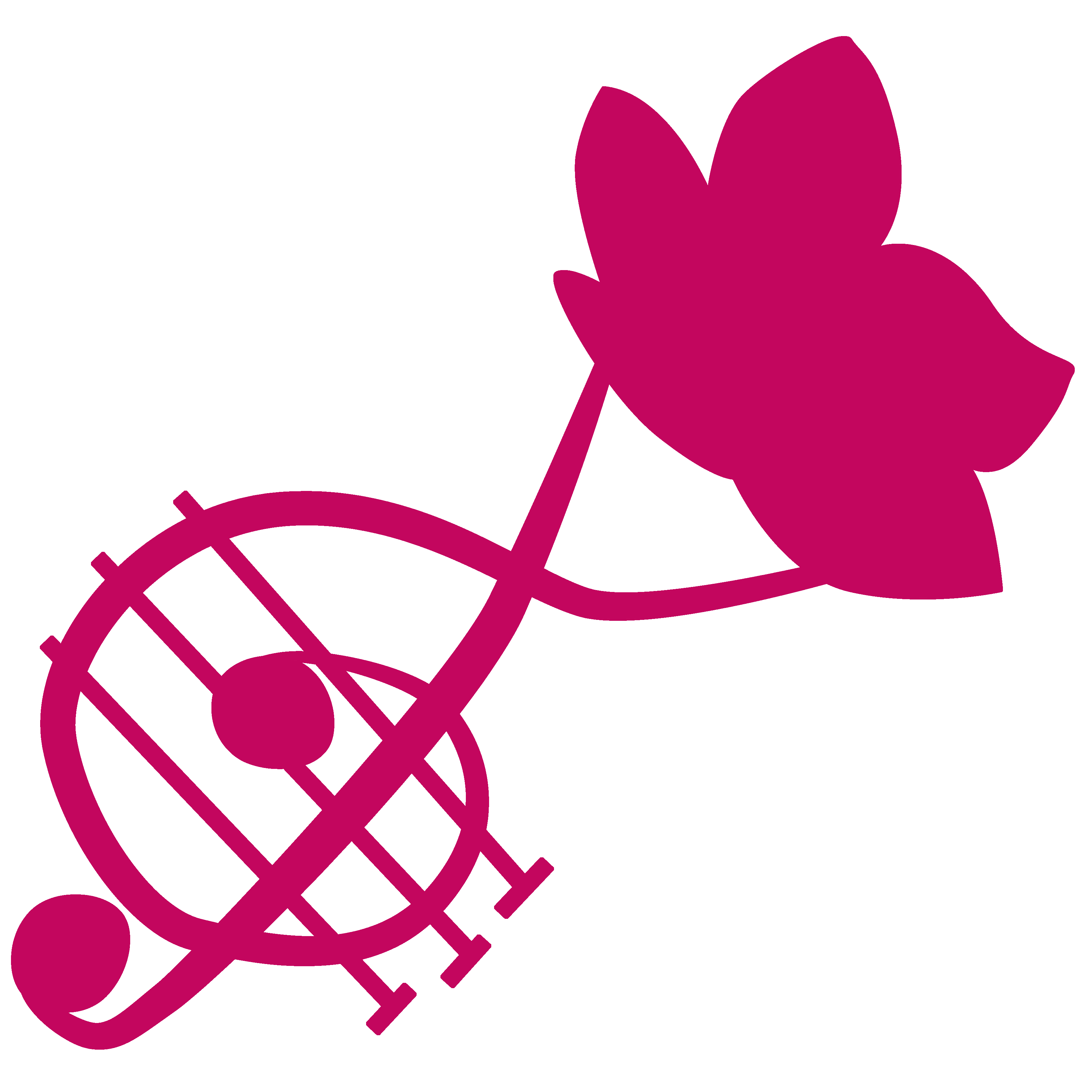
Spell & Mission Icons:
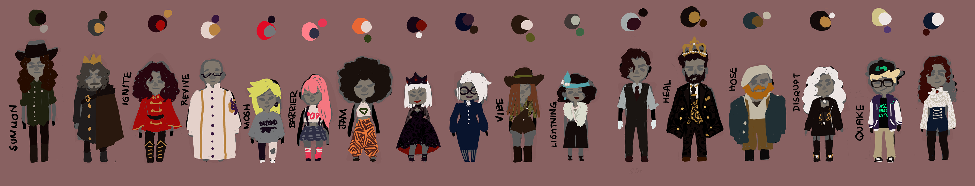
I didn't design the majority of the icons I used in the game. Instead many were supplemented by sorasak21. I thought the rounded shapes and minimalistic, glyph style would be perfect for the UI. Nevertheless, below are a few I created following the designer's style.

Mosh

Spells

Jam

Harmonize
Performance Mission
RECENT PROGRESS:
I've spent a bunch of time recently moving elements of the HUD around the screen and thinking of ways to reduce the number of things (controls for example) players would need to remember while they're playing the game. I've also become pretty satisfied with how the conducting staff looks and have added animations for PERFECT, GOOD, OKAY and MISS rhythm game ratings.
In addition to in-game elements, I have taken a closer look at the design of the main menu. The plan there is to use different backgrounds to convey Dissonant's narrative themes of cultural pluralism and coping with familial expectations and stage fright.
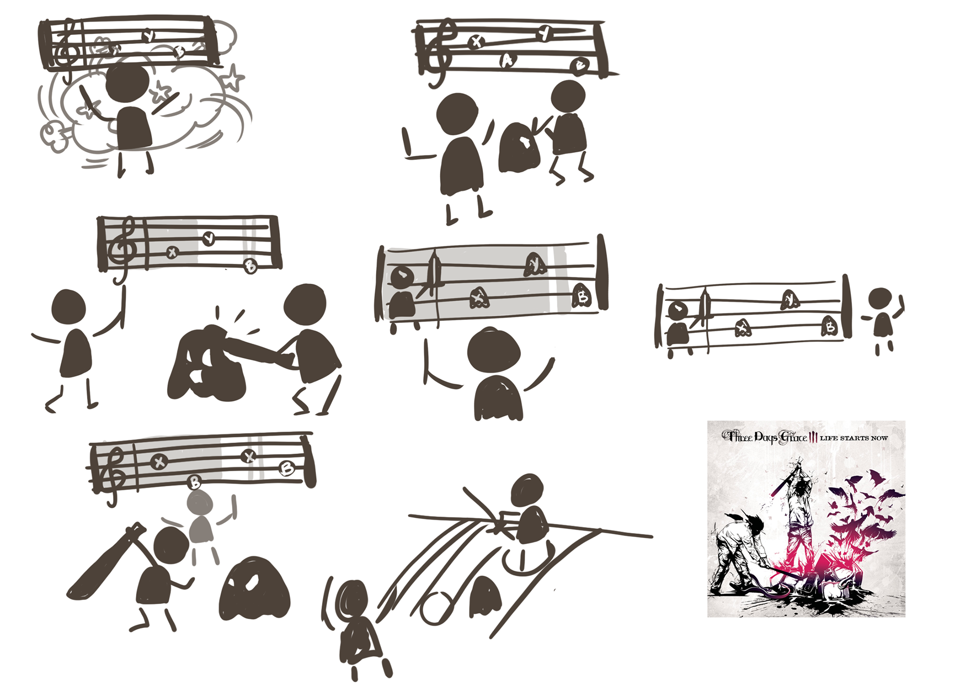
Conducting Interface Sketches - still very inspired by that Three Days Grace album cover.
Example of pressing the right button too early, pressing the wrong button and perfect hits. End animation is a placeholder.
More Implemented Features:
Locking On and Dialogue
Ocarina of Time style casting. 🅱️lef
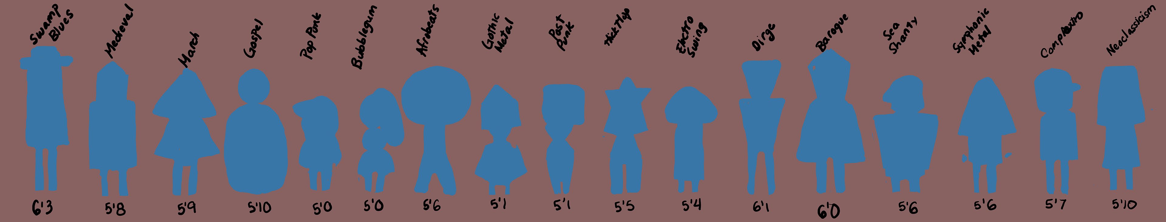
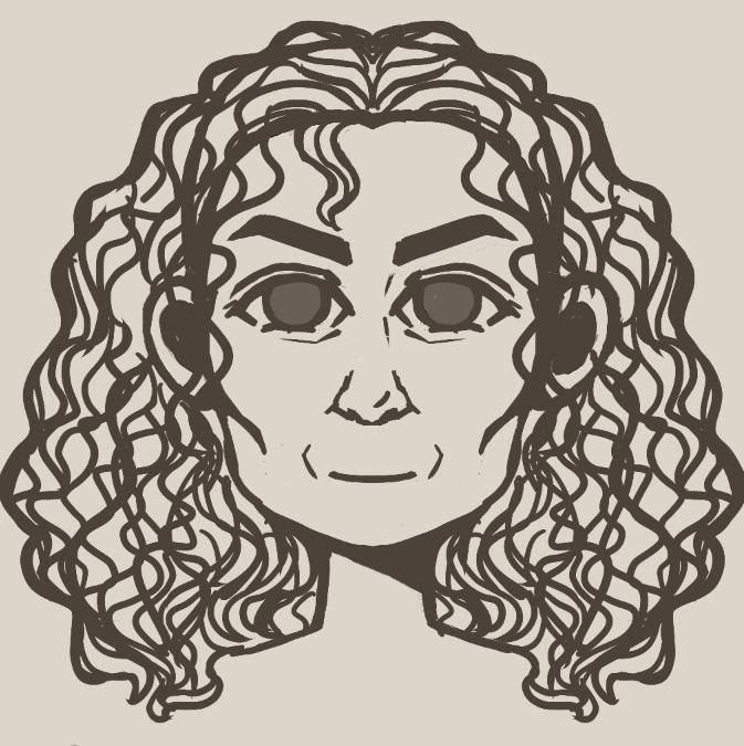
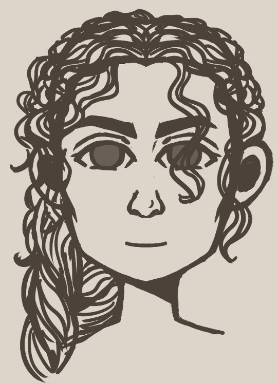
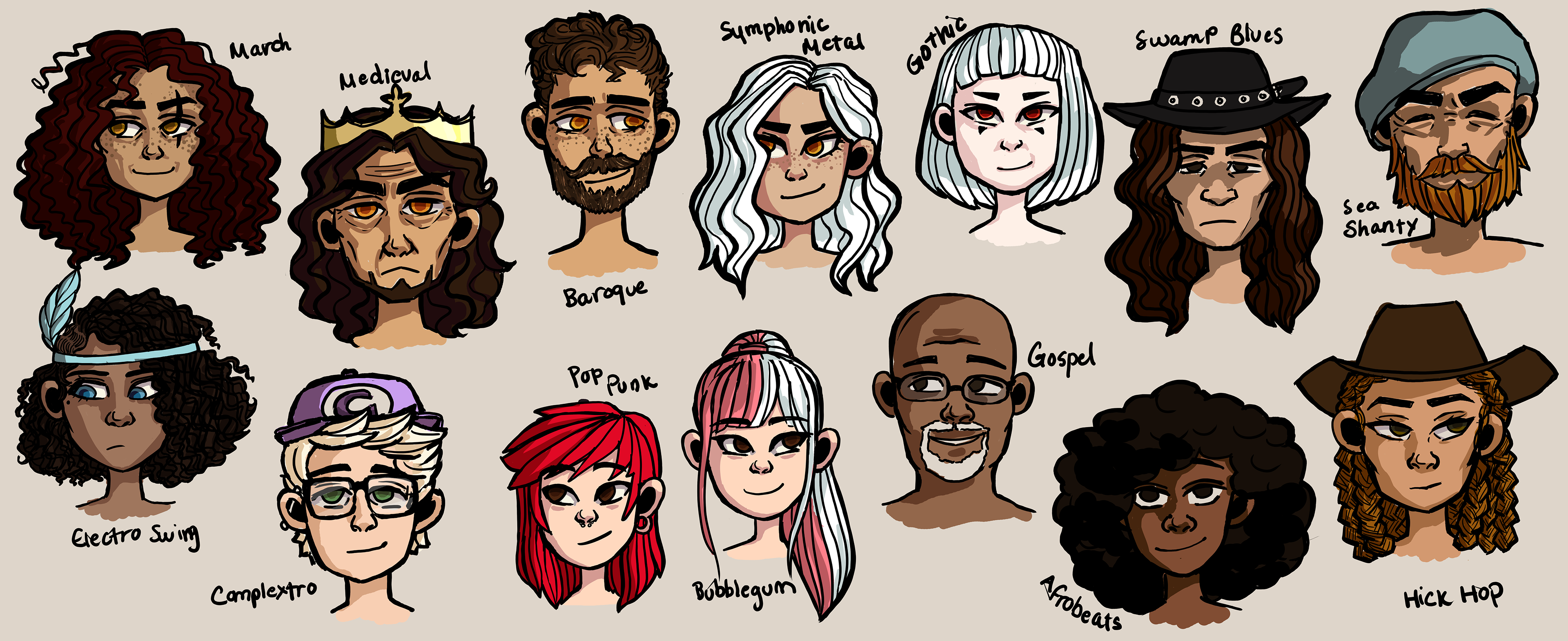
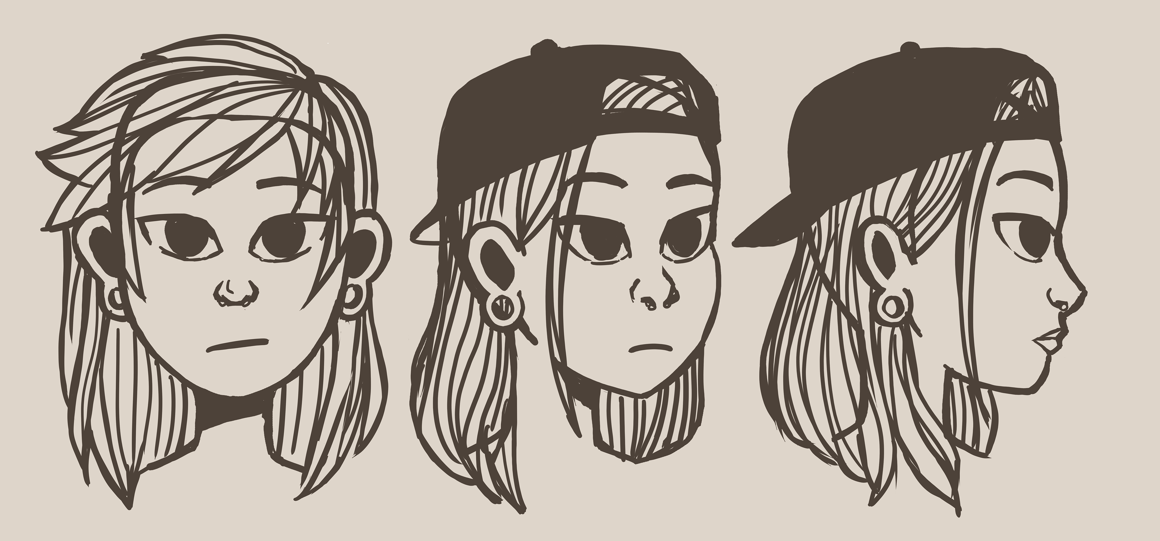
Character Art:
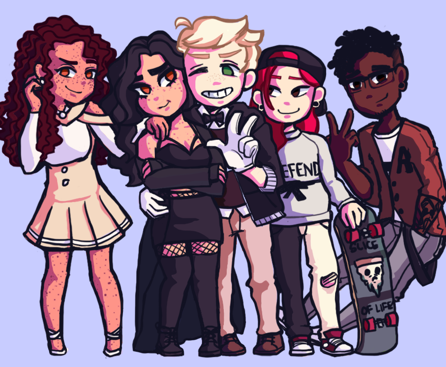
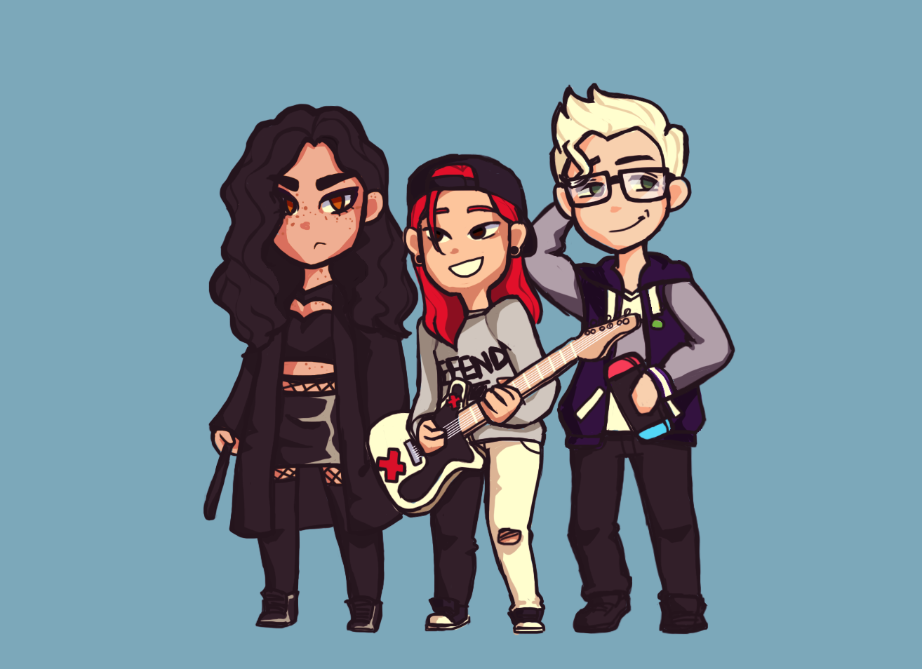
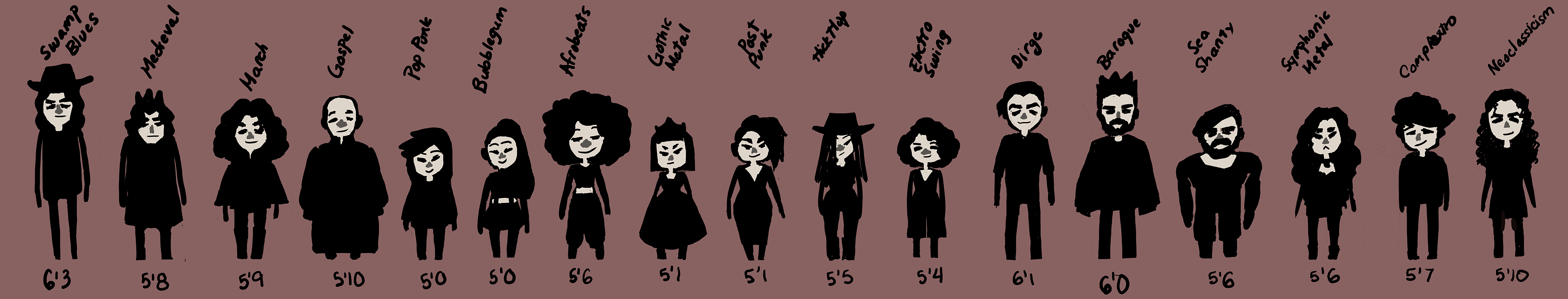
While you're still here, below is the concept art I've been working on for each of the genres!
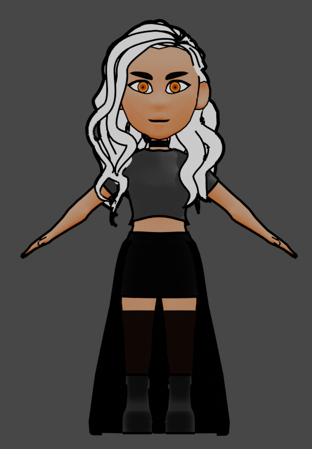
A 3D Model I Made of Symph